
Swichie began as an idea for a playful dessert brand built around colorful desserts, personality and the simple feeling of something made with care.
Because the brand was being created from the ground up, every visual decision had the opportunity to shape how Swichie would look, feel and communicate; from the name and logo to the colors, characters and supporting graphics.
Desserts are naturally colorful, fun and highly visual. The challenge was creating an identity that could capture that energy without looking like every other dessert brand.
Swichie also wasn't built around one specific product. The visual identity needed enough flexibility to work across different desserts, flavors, packaging and marketing while still feeling immediately recognizable.
Rather than allowing the product itself to become the identity, the goal was to build a personality around the brand.
Something playful. Something colorful. Something unmistakably Swichie.
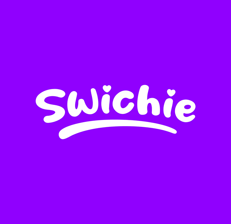
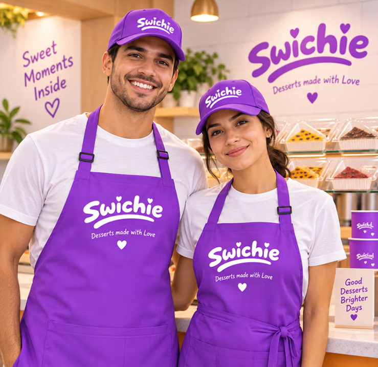
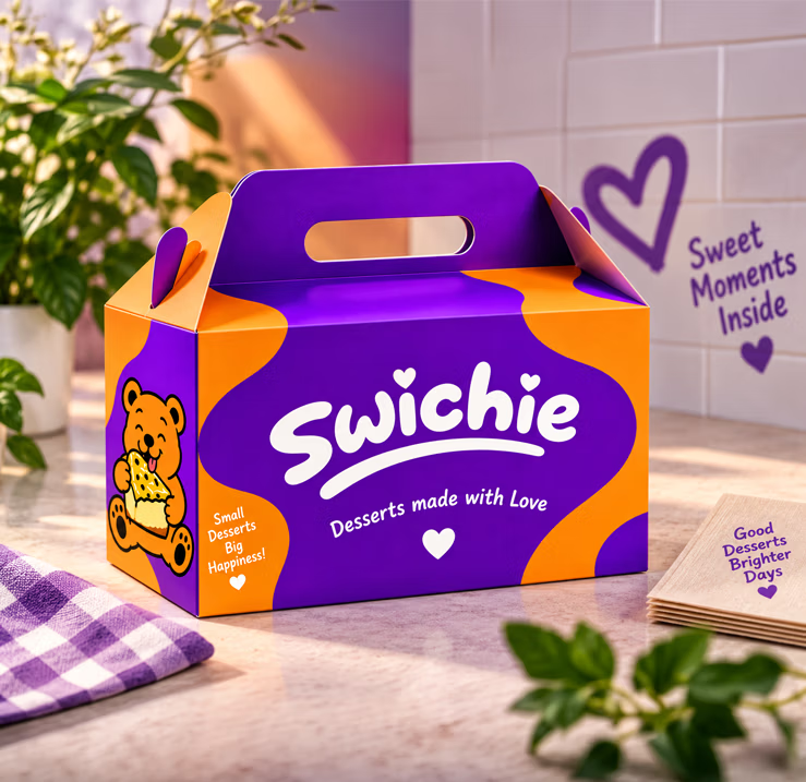
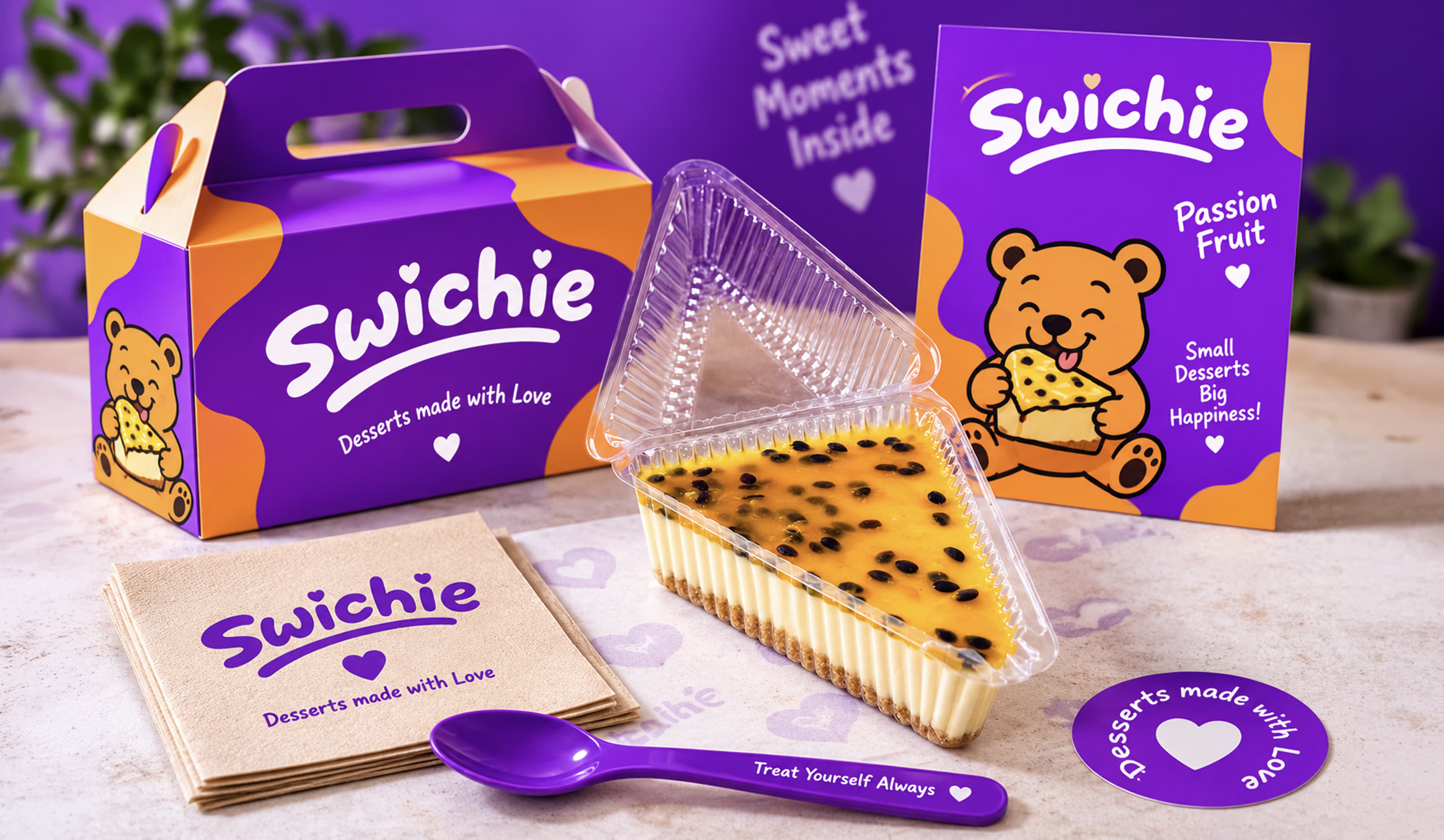
The identity was built around a bold purple and orange color palette, rounded typography, heart details and flowing graphic shapes that give Swichie an energetic and approachable personality.
Instead of relying only on the logo, the visual language expanded into secondary marks, illustrations and graphic elements that could be combined in different ways across the brand.
Purple became the dominant color, giving Swichie a strong visual signature, while orange introduced warmth and contrast inspired by the desserts themselves.
The result is a system that feels playful without depending on a single product or image to communicate what Swichie is.

The Swichie wordmark was designed around soft, rounded letterforms that reflect the friendly personality of the brand.
Small heart details introduce the idea of desserts made with love, while the sweeping underline adds movement and gives the wordmark a more recognizable silhouette.
The simplicity of the logo allows it to stand on its own, while the surrounding colors, characters and graphic elements bring more of Swichie's personality into each application.

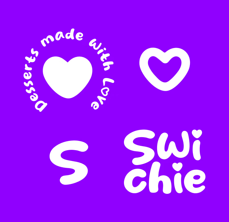
The idea of Desserts Made With Love became more than a message; it became part of Swichie’s visual identity. The custom heart was developed into a series of supporting marks, including the circular Desserts Made With Love badge, the outlined heart, a standalone S, and a vertical version of the Swichie wordmark.
Together, these elements give the identity more flexibility, allowing the brand to adapt to packaging, stickers, social content, and smaller spaces without relying on the primary logo every time.
Different expressions, all unmistakably Swichie.
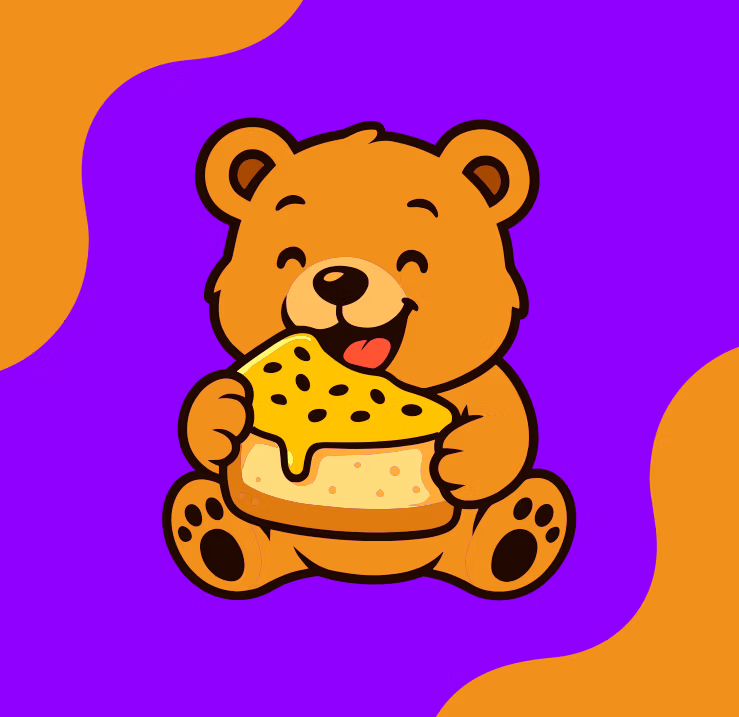
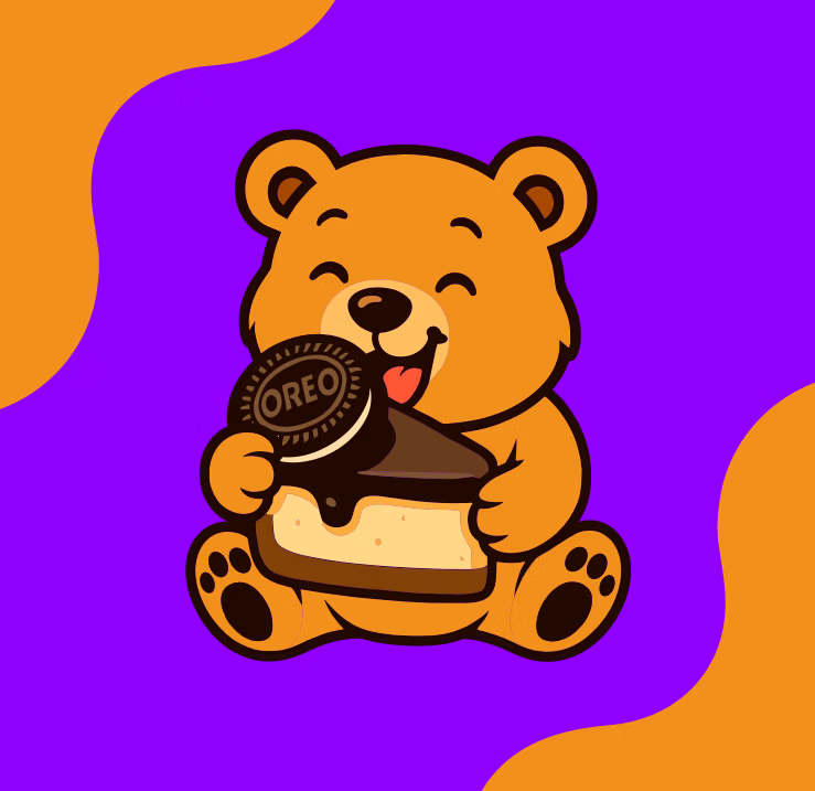
The Swichie bear became a flexible character within the identity, giving the brand a personality beyond the wordmark.
Rather than creating a single static mascot, different versions of the bear were illustrated around individual desserts and flavors. The character could change with the product while maintaining the same recognizable style and personality.
This created a growing illustration system that could be used across packaging, menus, social media and promotional materials.
The dessert changes. The character evolves. The brand stays Swichie.
The logo established the identity, but the brand needed enough visual language to work beyond a single mark.
Organic shapes, bold color combinations, heart details, character illustrations and secondary graphics were developed to work together as a flexible system. These elements could be rearranged and adapted depending on the application without losing the personality of the brand.
That flexibility allowed Swichie to remain visually consistent while still leaving room for new desserts, flavors and ideas.
The visual system was applied across customer-facing materials to test how the identity would work beyond the original concept. Business cards, social media graphics and other branded applications combined the logo, mascot, colors and supporting graphics into one consistent experience.
These applications helped establish how Swichie could communicate as a real dessert brand rather than simply existing as a logo.
Logo → Color → Character → Graphics → Brand Experience
Swichie developed from a dessert idea into a complete visual identity with its own recognizable personality.
The wordmark provides a simple foundation. The purple and orange palette creates recognition. Heart details reinforce the idea of desserts made with care, while the illustrated characters give different products their own personality within the same visual world.
Together, these elements created a brand capable of expanding across different desserts, packaging, social media and future applications without losing what makes Swichie recognizable.
What began as an idea became a brand with a personality of its own.