
Sultan’s Market is an established Middle Eastern and Mediterranean restaurant in Chicago. As the business expanded across the city, its digital presence needed to better reflect what Sultan’s Market had become. Four locations, an extensive menu, online ordering, catering, and different neighborhood audiences all needed to work together as one clear experience.
Sultan’s Market had grown into four Chicago locations, but the digital experience needed a clearer structure for connecting customers with the restaurant most relevant to them.
The challenge was to organize four locations, an extensive menu, online ordering and catering without fragmenting the brand or creating unnecessary steps for customers.
The solution became one digital system with four distinct local entry points.
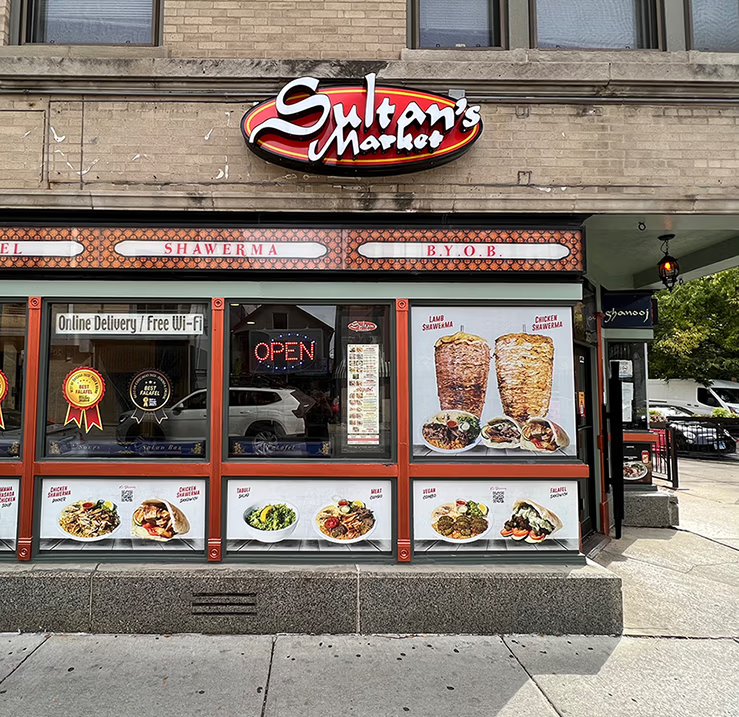
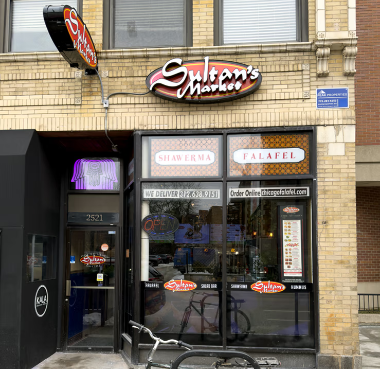
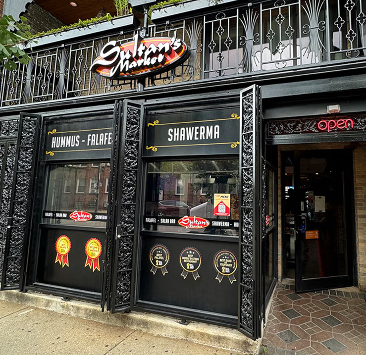
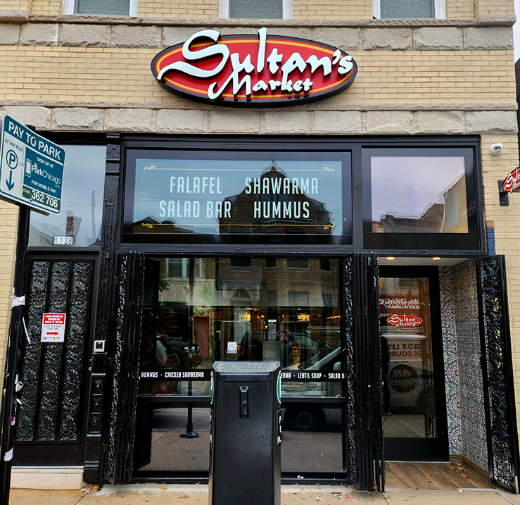
The Sultan’s Market signage was designed around the restaurant's existing identity, but the goal was to give it a stronger physical presence on the building.
Rather than using a conventional illuminated lightbox with the logo presented on a flat face, the lettering was mounted in front of the illuminated background, creating additional depth and dimension.
This layered construction gives the signage a more architectural appearance. During the day, the raised lettering creates natural depth and shadow; after dark, the illuminated background introduces another visual layer behind the logo.
The approach allowed the familiar Sultan’s Market identity to remain intact while creating storefront signage with more character than a traditional flat lightbox.
The identity stayed familiar. The way it was brought into the physical space became more dimensional.
The website needed to bring four locations, a large food menu, online ordering, catering and the story behind Sultan’s Market into one coherent experience.
I developed a new digital design direction around stronger typography, food-focused photography, custom iconography and a warmer, more restrained color system.
But the larger change was structural. Instead of treating every visitor as if they were looking for the same thing, the website creates clear paths between menu, ordering and individual locations.
That structure became the foundation for both the user experience and the local search strategy.
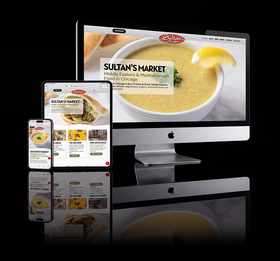
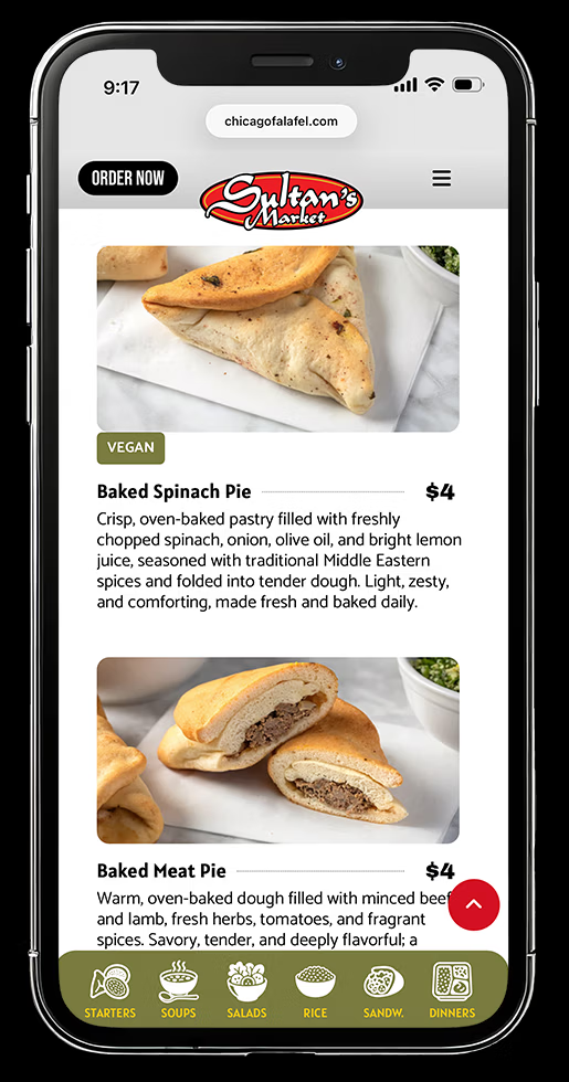
Sultan’s extensive menu could easily become a long mobile scroll. I organized dishes into clearly defined categories and created custom category icons with persistent mobile navigation, allowing customers to move directly between Starters, Soups, Salads, Rice, Sandwiches and Dinners.
Dish descriptions were also rewritten to communicate ingredients, preparation and dietary options more clearly without turning the menu into keyword-heavy SEO copy.
Food photography was given greater visual priority throughout the experience, allowing customers to understand dishes before reaching the ordering platform.
The menu became something customers could explore rather than simply scroll through.
I created a dedicated experience for each Sultan’s Market location:
Wicker Park · Lincoln Park · Logan Square · Pilsen
Each location page brings its address, hours, phone number, ordering path, neighborhood context and location-specific information together in one place.
Global location navigation connects all four restaurants while individual pages give customers a direct path to the Sultan’s closest or most relevant to them.
One brand at the website level. Four distinct customer entry points at the neighborhood level.
The four-location structure was also designed around how Sultan’s Market appears in local search.
I built dedicated landing pages for Wicker Park, Lincoln Park, Logan Square and Pilsen, each with location-specific content, contact information, internal linking, FAQs and structured business data.
Each Google Business Profile was then connected to its corresponding location page rather than sending every customer to the same generic destination.
Menu content, headings, image filenames, alt text and internal links were optimized using natural language so search engines and AI systems could better understand Sultan’s food, locations and relationship to each Chicago neighborhood.
This created a more direct discovery path: LOCAL SEARCH → LOCATION → MENU → ORDER / CALL / DIRECTIONS


Many restaurant websites compete with their food photography through highly saturated backgrounds and interface colors. For Sultan’s Market, I took the opposite approach.
I built the digital palette around warm cream, natural olive, black, and restrained brand accents to reflect the freshness and warmth I associate with the restaurant while creating a quieter environment for the food.
Against those tones, the ingredients provide the strongest color; golden falafel, bright vegetables, fresh greens, hummus, shawarma, and colorful salads naturally move to the foreground.
The palette doesn't compete with the food. It gives the food room to look its best.
Sultan’s Market now has a more connected system across storefront signage, website, menu experience, individual location pages and local search.
The physical identity remains familiar, while the digital experience gives each neighborhood location a clearer path from discovery to ordering or visiting.
Four restaurants. One recognizable Sultan’s Market experience.