
Rupee Wine & Spirits is a neighborhood liquor store in Chicago's Uptown community. As a new business, it needed an identity and storefront presence that could feel distinctive from the beginning and establish its place in the neighborhood.
The project began with a clear direction from the owner: the storefront should have the character of an old-school illuminated sign, rather than the appearance of a typical modern liquor store.
That meant the identity needed to work at architectural scale, visible from the sidewalk, recognizable from a distance and strong enough to become part of the storefront itself.
The sign wasn't simply an application of the brand. It helped define what the brand would become.
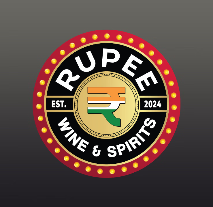
The name provided the starting point. I used the Indian rupee symbol as the visual anchor of the identity, incorporating the colors of the Indian flag into the mark and surrounding it with a circular badge inspired by traditional neighborhood signage.
A black, red and gold palette extended that direction, giving the identity a bold, established appearance while supporting the vintage illuminated-sign concept.
The circular emblem was then developed as the centerpiece of the storefront, connecting the logo directly to the physical architecture of the business.
Name → Symbol → Identity → Signage
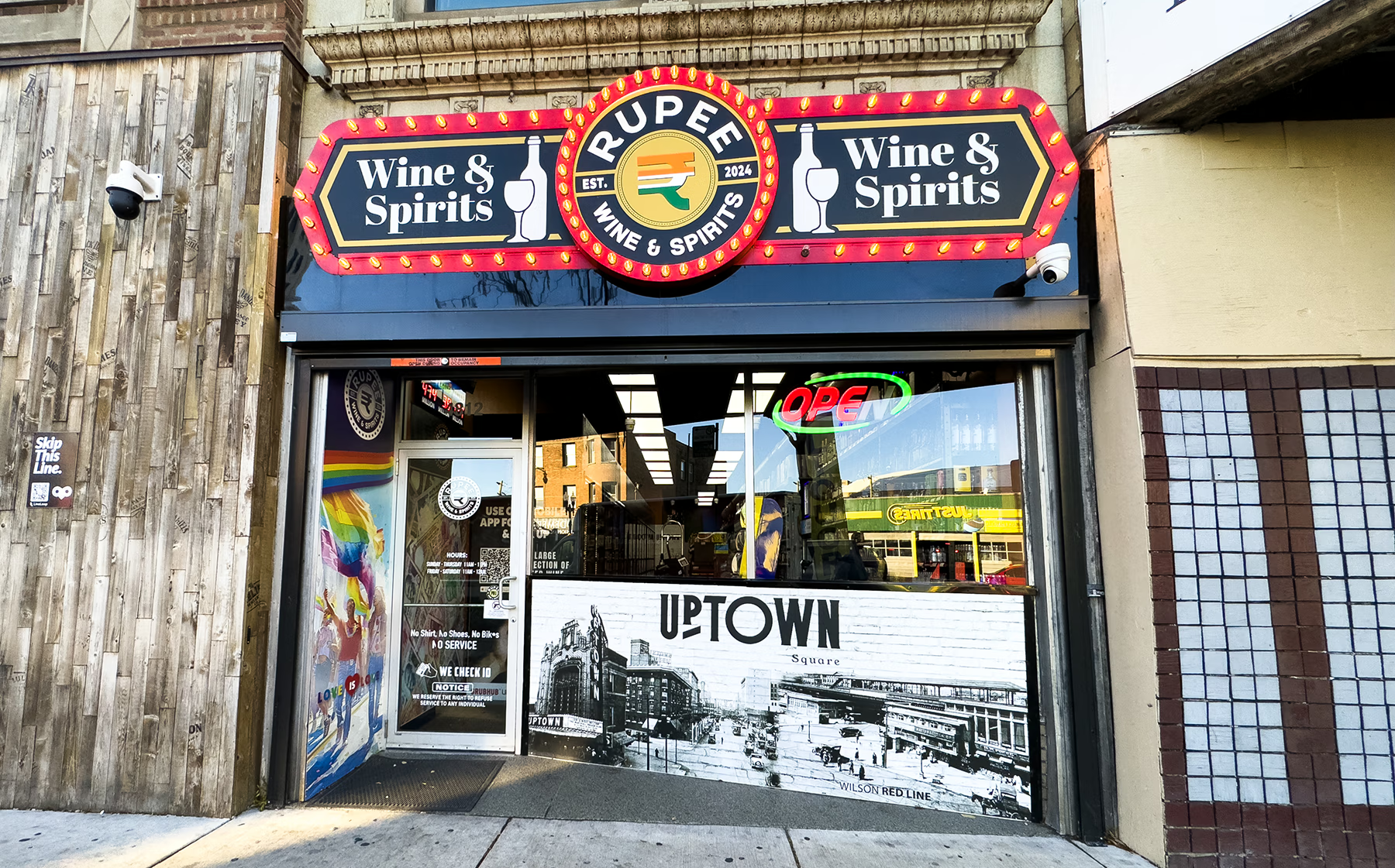
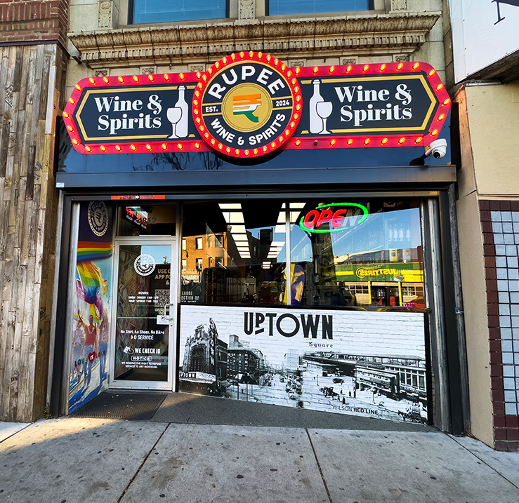
The primary storefront sign became the largest expression of the identity. Instead of a standard rectangular cabinet, the design uses a large circular Rupee emblem as the centerpiece, extending beyond the horizontal Wine & Spirits panels on either side.
The red perimeter and exposed bulbs reinforce the old-school marquee character requested by the owner, while the black and gold panels create strong contrast and street-level readability.
Most importantly, the distinctive silhouette gives the storefront a visual presence that can be recognized before the customer ever walks through the door.
The storefront itself became one of the brand's strongest identifiers.
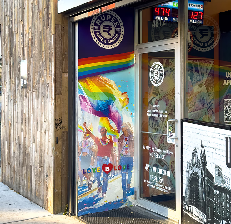
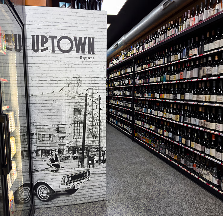
The visual identity continued beyond the logo and storefront signage through graphics designed for both the interior and exterior of the store.
Large-format window and wall graphics draw inspiration from Chicago's Uptown neighborhood, incorporating historic imagery and local references that connect the store to the community around it.
The visual system was also carried into practical customer touchpoints, including entrance graphics, store information and sidewalk signage promoting mobile ordering and delivery.
Rather than treating each piece as a separate design, the graphics work together to create a consistent visual experience throughout the space.
From the storefront to the interior, every application feels like part of the same brand.
Rupee Wine & Spirits began with a name and an idea for an old-school storefront sign. That direction grew into a cohesive identity carried across the logo, exterior signage and graphics throughout the space.
The result gives a new business an immediately recognizable presence while connecting it visually to the Uptown neighborhood around it.
A brand designed for the place customers experience it first: the street.
From your storefront to your website, I create cohesive brand experiences designed to help your business look consistent, professional, and easy to recognize.