
Sultan’s Market is an established Middle Eastern and Mediterranean restaurant in Chicago. As the business expanded across the city, its digital presence needed to better reflect what Sultan’s Market had become. Four locations, an extensive menu, online ordering, catering, and different neighborhood audiences all needed to work together as one clear experience.
Northside Grill already had the foundation of a neighborhood restaurant, but its visual identity didn't fully communicate the warmth, familiarity and everyday character of the business.
The challenge was to create something more recognizable without making the restaurant feel overly polished or disconnected from the people it serves.
The new direction needed to work across very different environments, from a logo and restaurant website to a storefront with limited architectural space.
The goal wasn't to change what Northside Grill is. It was to make its identity better reflect it.
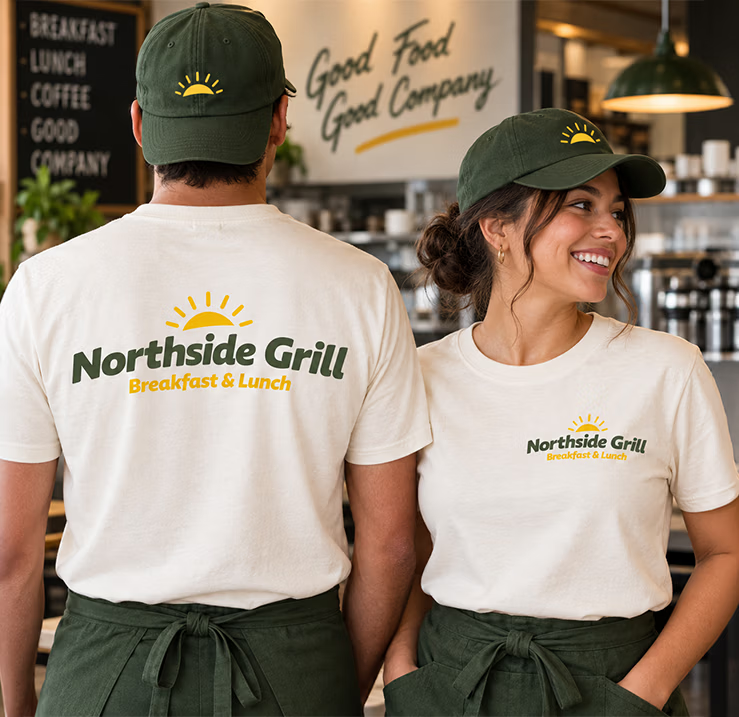
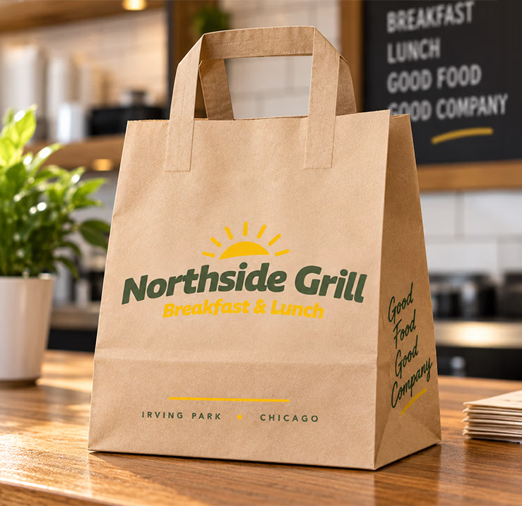
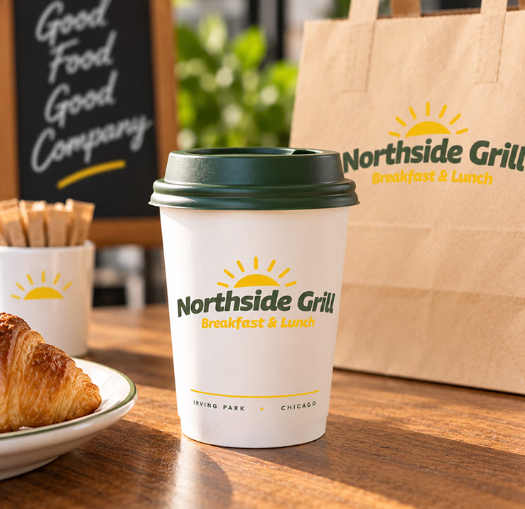

Northside Grill needed an identity that felt approachable and familiar while giving the restaurant a more distinctive presence.
The visual direction was inspired by what the restaurant actually is: a neighborhood place where people start their morning, meet for breakfast, stop in for lunch and return to familiar food.
Rather than using typical diner imagery, the identity was built around a simple visual idea: the rising sun. It connects naturally to breakfast and the beginning of the day while giving Northside Grill a recognizable graphic element that can work independently from the full logo.
The olive green and warm yellow palette reinforces that direction, creating a visual language that feels warm, fresh and welcoming without losing the casual personality of a neighborhood grill.
From there, the identity could extend naturally across the website, signage, menus, packaging and everyday marketing.
Simple enough for a neighborhood restaurant. Distinctive enough to become its own brand.
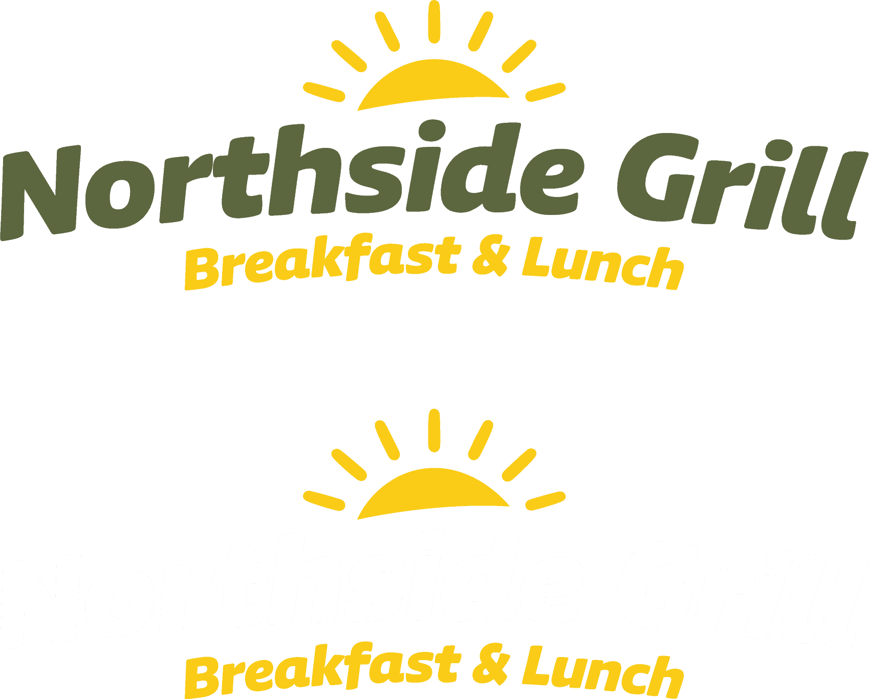
The Northside Grill logo was designed to be straightforward, friendly and easy to recognize. A bold, slightly rounded wordmark gives the name personality without making it feel overly formal or complicated.
Above the name, the rising sun becomes the defining symbol of the identity. Its position reinforces the idea of a new morning while creating a compact visual signature that can also work independently on hats, packaging, social media and other small applications.
The Breakfast & Lunch descriptor makes the restaurant's focus immediately clear, while the green and yellow color combination connects the logo to the larger visual system.
Bold & Confident
Friendly & Familiar
Simple & Recognizable
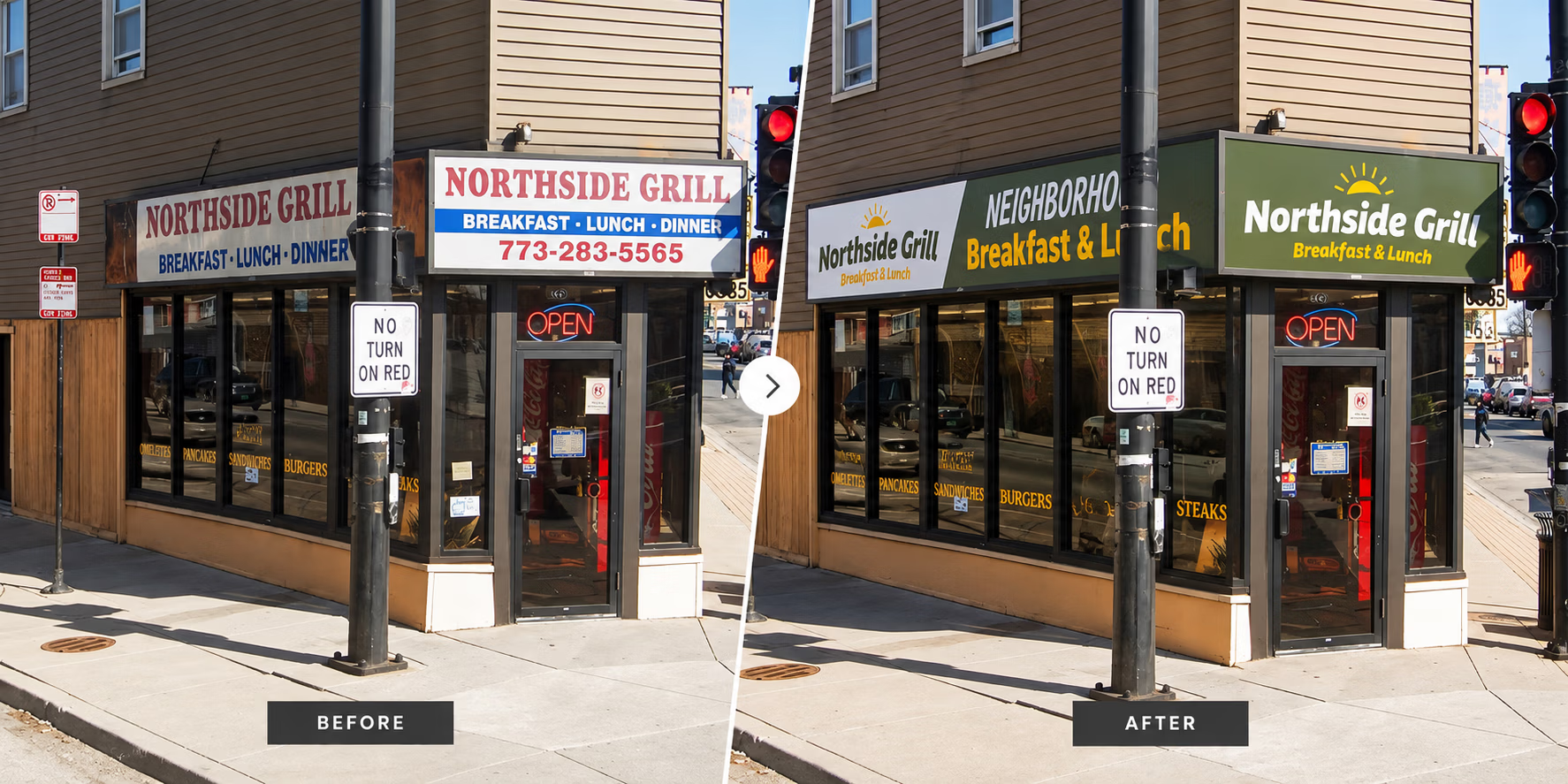
Northside Grill occupies a corner storefront where the available sign area is divided across multiple architectural surfaces rather than one large, uninterrupted façade.
Instead of forcing the identity into a single conventional sign, the signage concept was designed around the building itself.
The Northside Grill identity anchors the primary corner sign, while the longer side elevation creates room for supporting messaging such as Neighborhood Breakfast & Lunch.
Together, the different sign areas function as one visual system and provide visibility from more than one direction of traffic. The concept demonstrates how the identity could extend into the physical location while working within the limitations of the existing architecture.
The storefront wasn't treated as an empty canvas. The design had to respond to the space that was actually available.
The website extended the new identity into the place where many customers encounter Northside Grill before ever walking through the door.
The visual direction was built around the personality of the restaurant itself, warm food photography, the new color palette, simple typography and messaging centered around neighborhood breakfast and lunch.
The homepage immediately establishes what Northside Grill is and where it is located, while giving customers direct access to the actions that matter most.
View the Menu · Order Online · Visit Northside Grill
The result connects the restaurant customers see on the street with the restaurant they discover online.
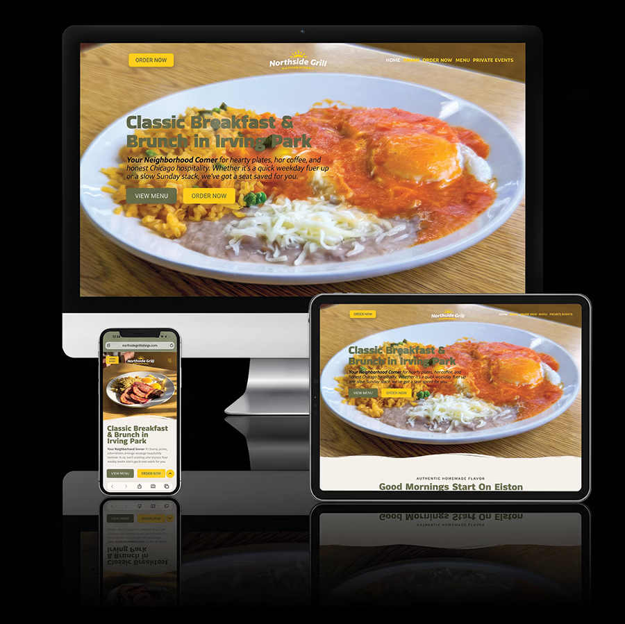
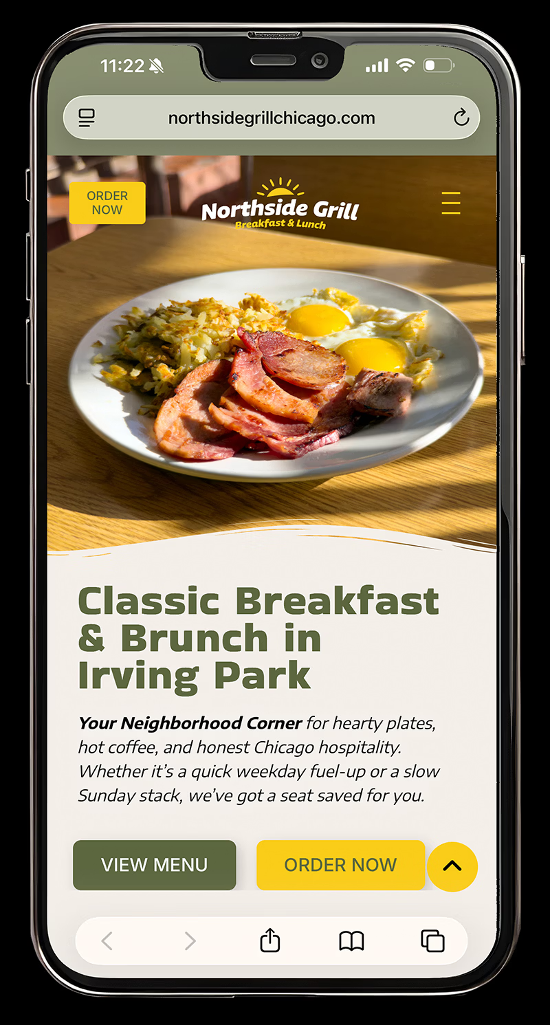
The website wasn't structured simply to present information. It was designed around the reasons someone visits a neighborhood restaurant website in the first place.
Customers need to quickly understand what Northside Grill serves, explore the menu, check the hours, order food, find the restaurant or learn about additional offerings such as private events.
Those actions were brought forward through a simpler navigation structure, clear calls to action and a mobile experience designed for customers arriving directly from local search.
Food photography also plays an important role in the interface. Rather than using imagery primarily as decoration, dishes become part of the navigation and help customers understand the restaurant before they begin exploring the menu.
DISCOVER → EXPLORE → ORDER / VISIT
What began as a brand redesign developed into a more complete system for how Northside Grill presents itself.
The new identity gives the restaurant a warmer and more recognizable visual language. The storefront signage concept demonstrates how that identity can adapt to the unusual corner architecture. And the website carries the same personality into a practical digital experience built around food, ordering and local discovery.
Each part solves a different problem, but they are designed to feel like the same Northside Grill.
A neighborhood restaurant with an identity designed to work from the corner to the screen.
From your storefront to your website, I create cohesive brand experiences designed to help your business look consistent, professional, and easy to recognize.