
El Cubanito is a neighborhood Cuban Restaurant in Chicago built around the flavors people know and love, from Cuban sandwiches and cafecito to empanadas and everyday favorites. I worked with El Cubanito to bring that personality into a more cohesive brand experience, developing a new visual identity and carrying it through the storefront signage, digital menus, website, and online presence.
El Cubanito already had a recognizable neighborhood presence, but its visual identity had developed across different touchpoints without one consistent system.
The challenge was creating an identity flexible enough to work across storefront signage, digital menus, merchandise, packaging and a new website while preserving the warmth and personality people already associated with the restaurant.
The solution needed to work just as well on the street as it did on a screen.
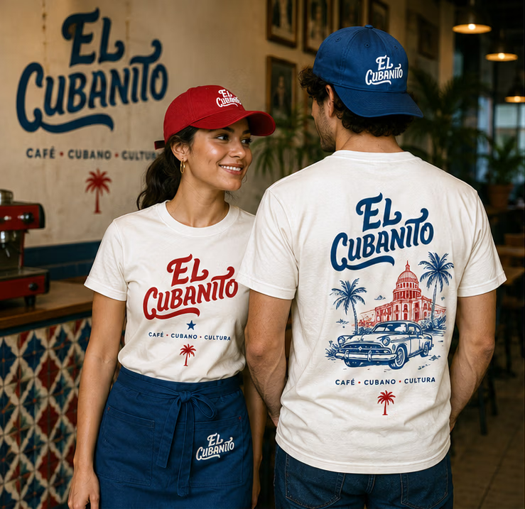
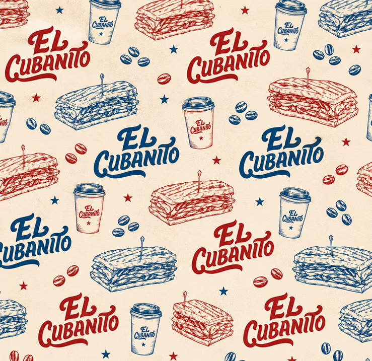
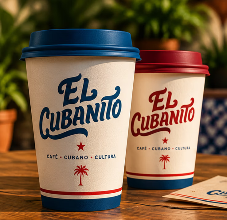

The branding process began by defining a visual direction that felt contemporary without losing the character associated with a traditional Cuban Restaurant.
Rather than relying heavily on stereotypical Cuban imagery, the identity was designed around strong typography, confident colors and simple graphic elements that could become recognizable on their own.
The final palette combines Havana Red, deep Navy and warm Cream, creating a distinctive identity that feels energetic, welcoming and established.
The visual system was then extended across signage, menus, digital interfaces and marketing materials so customers encounter the same El Cubanito wherever they interact with the business.

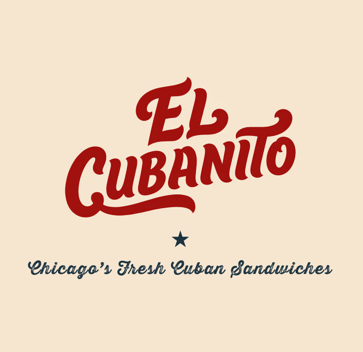
The El Cubanito logo was custom-drawn rather than built from an existing font. Each letter was shaped and refined to create a distinctive wordmark developed specifically for the brand.
Bold & Confident
Friendly & Welcoming
Vintage Inspired
Timeless & Distinctive
The flowing baseline beneath “Cubanito” creates movement and brings energy to the wordmark, while helping anchor the composition. Its curves subtly reference the rhythm and expressive character associated with Cuban culture without relying on obvious visual clichés. Rounded terminals and soft curves give the lettering a handcrafted quality, reinforcing the warmth and personality of a neighborhood café built around food made with care.
The exterior signage became one of the first opportunities to test the new identity in the real world.
The custom wordmark was translated into flush-mounted LED channel letters with white illuminated faces, blue returns and red halo illumination, preserving the proportions and character of the original lettering at architectural scale.
The brick façade was intentionally left visible rather than introducing an additional sign background. During the day, the white faces provide a clean contrast against the building; after dark, the red halo creates depth and gives the storefront a distinctive presence from the street.
The logo wasn't simply placed on the building. The building became part of how the identity was experienced.
El Cubanito didn't previously have a dedicated website, so the project started without an existing digital structure to work around.
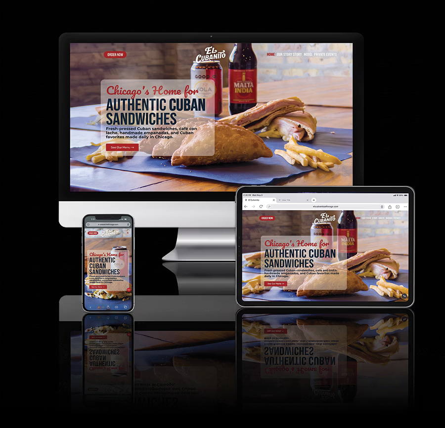
I translated the new visual identity into a responsive website using the same colors, typography, photography and graphic language developed for the physical brand.
The site was then structured around El Cubanito's core customer actions; exploring the food, ordering online, understanding the service hours, finding the restaurant and learning the story behind it.
Rather than creating a digital brochure, the website became the central point connecting the restaurant's brand, menu, ordering and local presence.
The result is a website that doesn't simply show El Cubanito; it feels like El Cubanito.


El Cubanito's menu contains multiple categories of sandwiches, empanadas, coffee, shakes, sides and other Cuban favorites. On mobile, presenting everything as one continuous page would create unnecessary scrolling.
I created custom category icons with internal menu navigation, allowing customers to jump directly to the section they want instead of moving through the entire menu.
The navigation remains visually connected to the identity while solving a practical usability problem.
A large menu became easier to explore without making it feel smaller.
El Cubanito operates differently throughout the day, with the dining room available during daytime hours and pickup continuing through the evening window. Rather than presenting one general set of business hours, I separated the two experiences:
Inside Service
7:00 AM – 5:00 PM
Evening Pickup Window
5:00 PM – 10:00 PM
The distinction answers an important customer question before they need to ask it: Can I go inside, or am I ordering through the window?
Good UX isn't always a new feature. Sometimes it's simply removing ambiguity.
The website was structured so search engines and AI systems could clearly understand what El Cubanito is, where it is located and what it serves.
Individual menu items were given descriptive content, while headings, internal navigation, FAQs, image filenames, alt text and structured business information reinforced the restaurant's relationship to Cuban food and its Chicago location.
The website was also connected to the broader local customer journey through Google Business Profile, directions, reviews and online ordering.
SEARCH → WEBSITE → MENU → ORDER / DIRECTIONS
What began as a brand redesign became a connected customer experience. From discovering El Cubanito online to recognizing the storefront from the street and experiencing the brand inside the restaurant, every touchpoint now speaks the same visual language.
Brand, digital, and physical, designed as one experience.